This visual depicts the 11 most important and must-know plots in DS:
Today, let’s understand them briefly and how they are used.
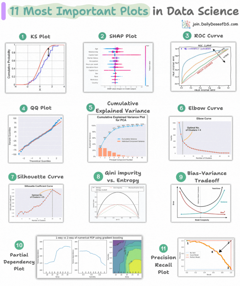
1) KS Plot:
- It is used to assess the distributional differences.
- The idea is to measure the maximum distance between the cumulative distribution functions (CDF) of two distributions.
- The lower the maximum distance, the more likely they belong to the same distribution.
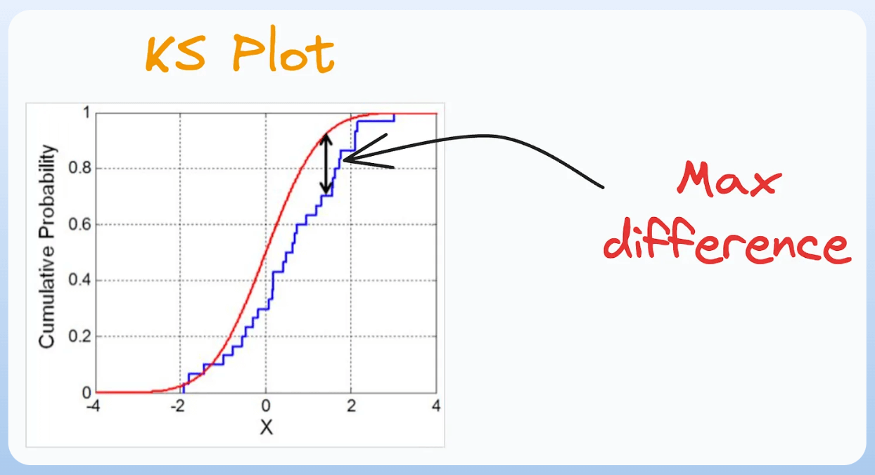
2) SHAP Plot:
- It summarizes feature importance to a model’s predictions by considering interactions/dependencies between them.
- It is useful in determining how different values (low or high) of a feature affect the overall output.
- We covered model interpretability extensively in our 3-part crash course. Start here: A Crash Course on Model Interpretability →
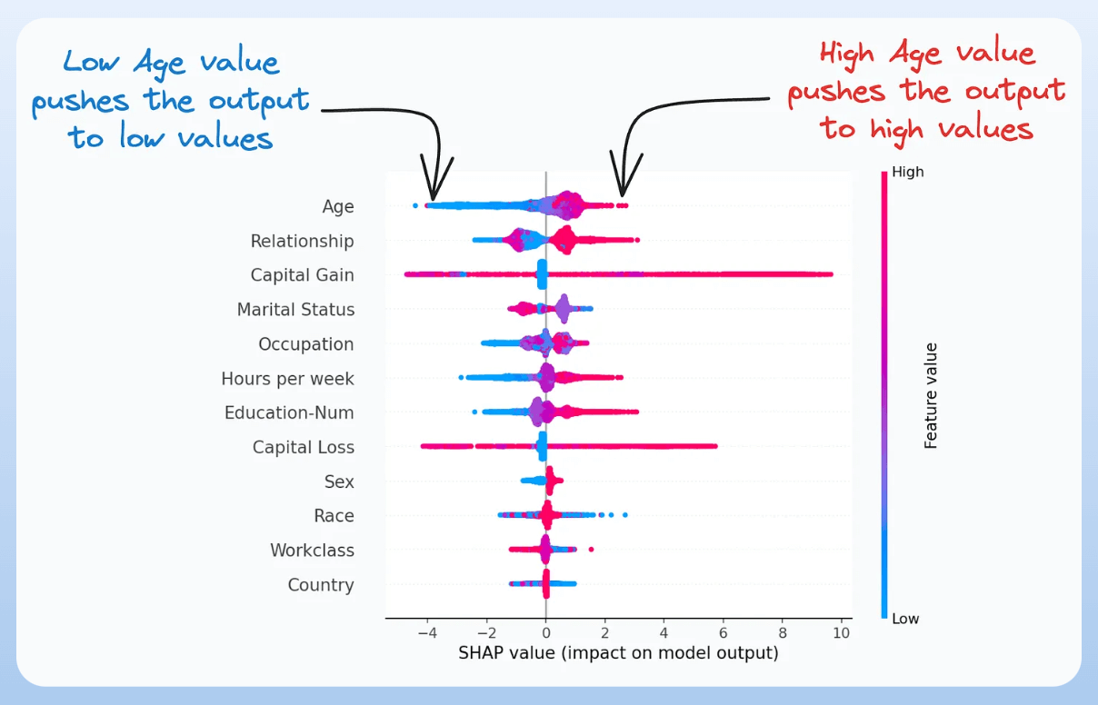
3) ROC Curve:
- It depicts the tradeoff between the true positive rate (good performance) and the false positive rate (bad performance) across different classification thresholds.
- The idea is to balance TPR (good performance) vs. FPR (bad performance).
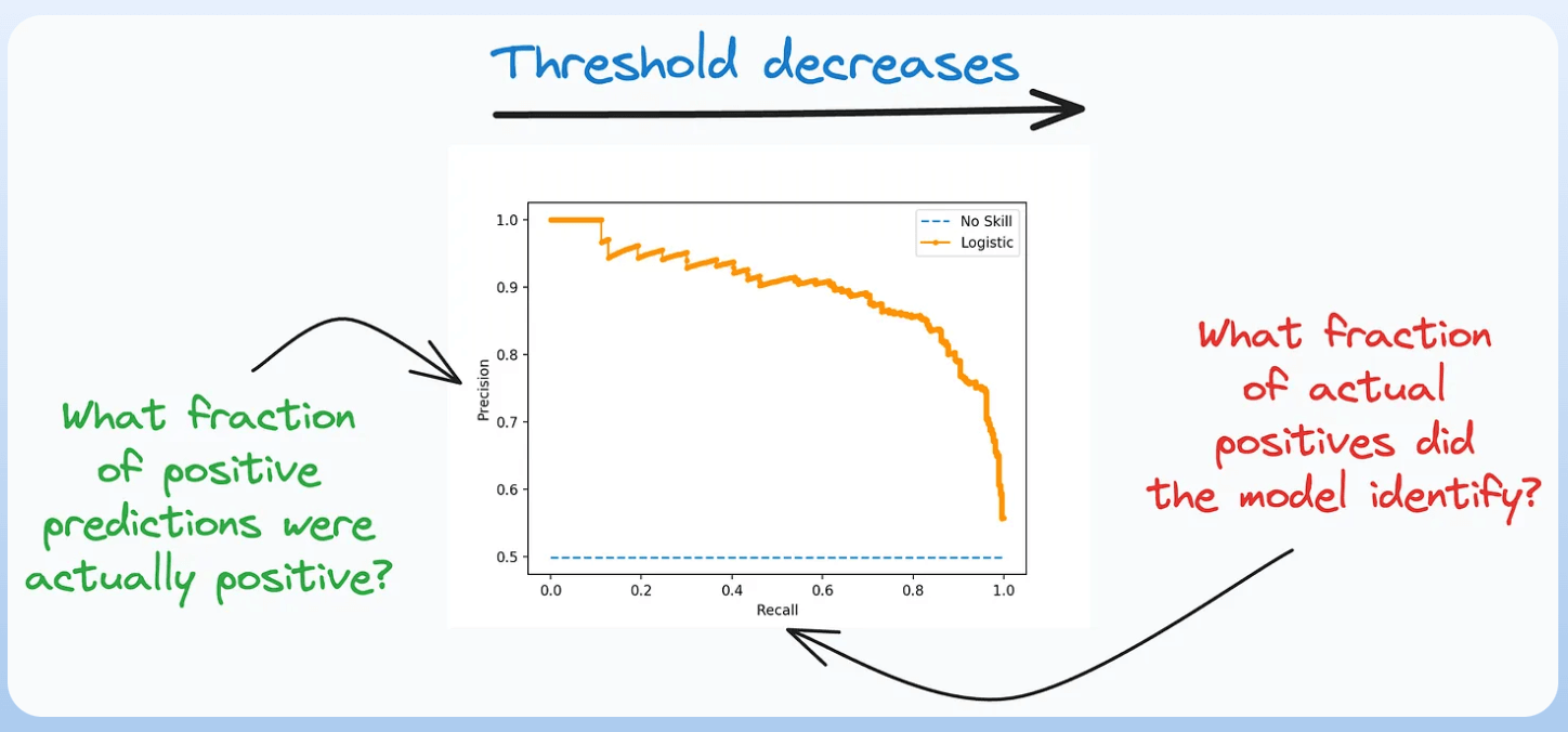
4) Precision-Recall Curve:
- It depicts the tradeoff between Precision and Recall across different classification thresholds.
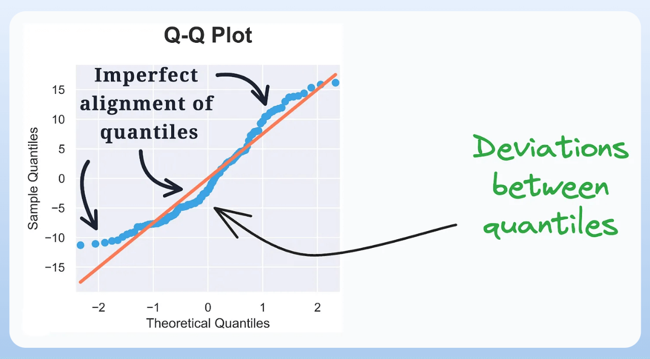
5) QQ Plot:
- It assesses the distributional similarity between observed data and theoretical distribution.
- It plots the quantiles of the two distributions against each other.
- Deviations from the straight line indicate a departure from the assumed distribution.
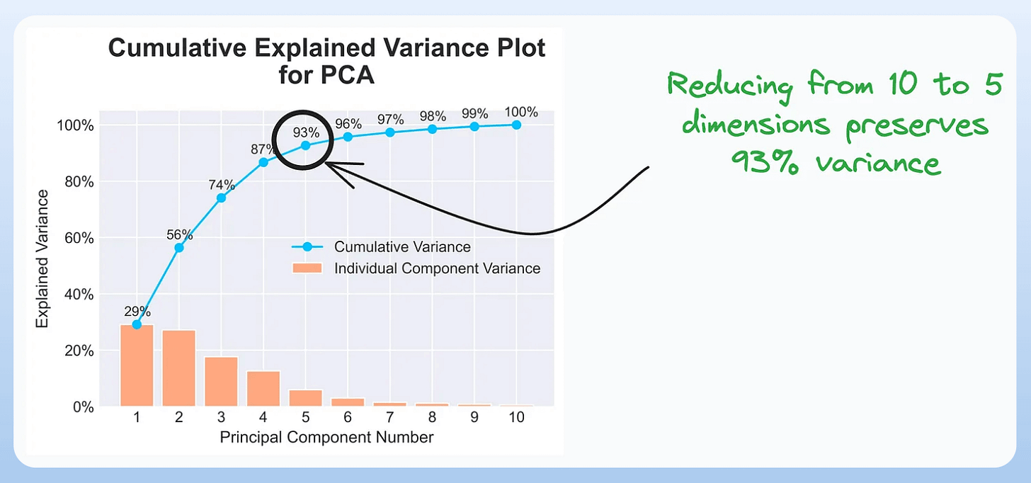
6) Cumulative Explained Variance Plot:
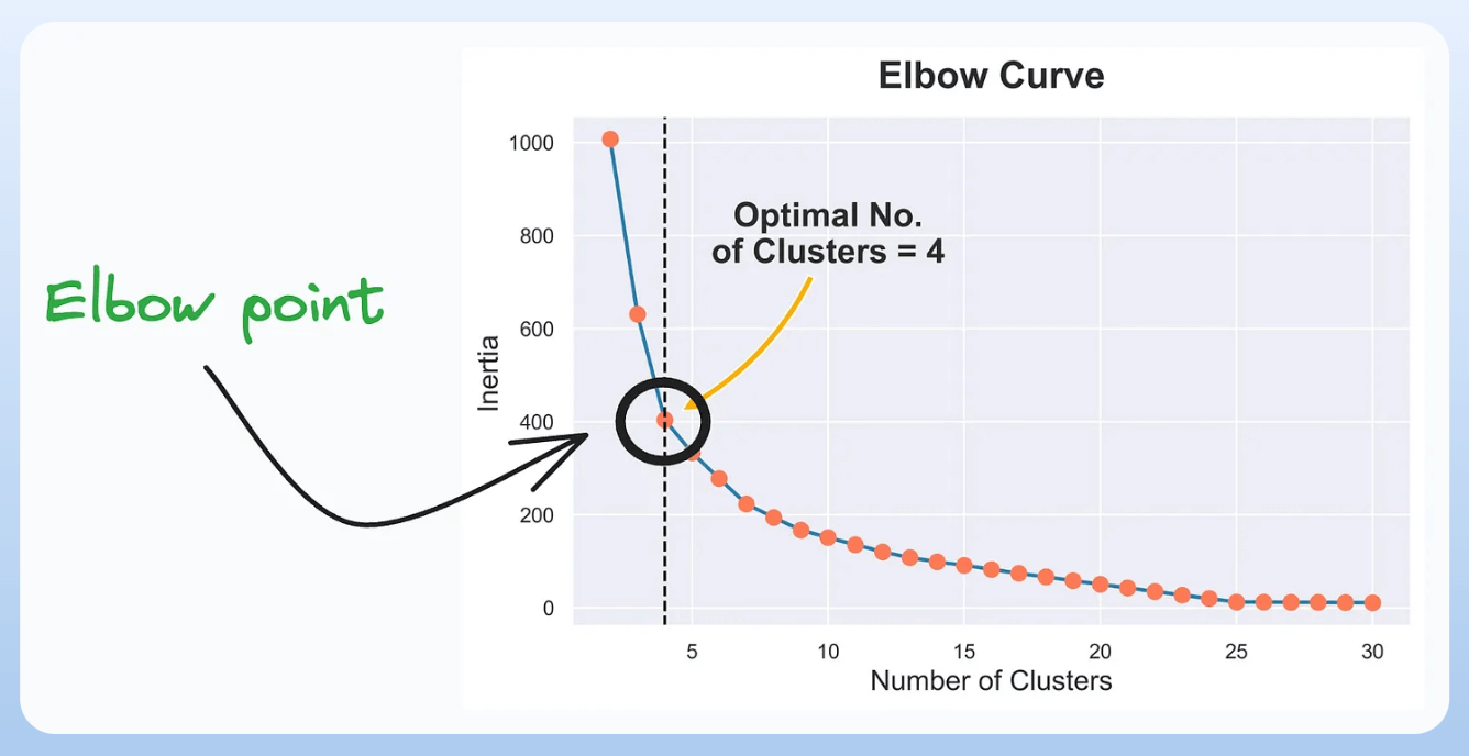
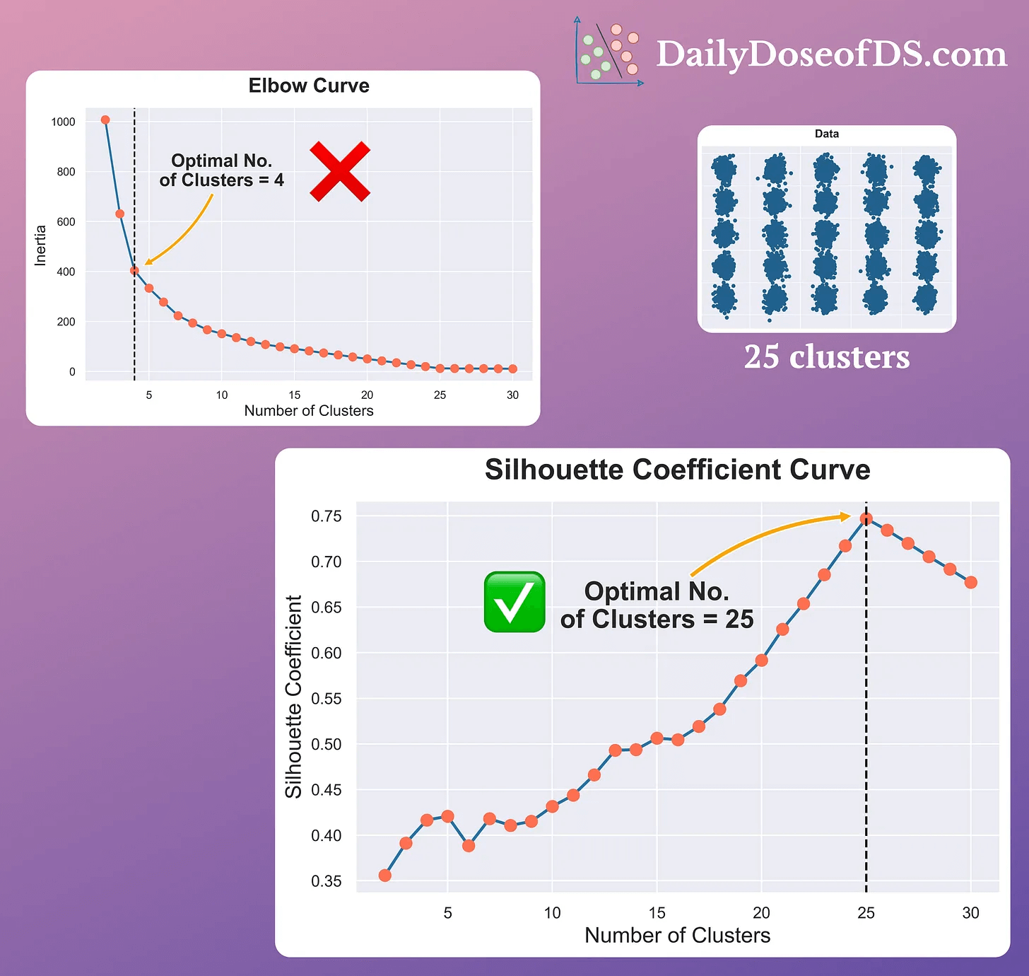
7) Elbow Curve:
- The plot helps identify the optimal number of clusters for the k-means algorithm.
- The point of the elbow depicts the ideal number of clusters.
8) Silhouette Curve:
- The Elbow curve is often ineffective when you have plenty of clusters.
- Silhouette Curve is a better alternative, as depicted above.
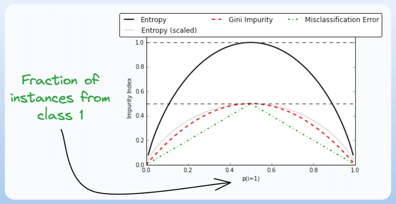
9) Gini-Impurity and Entropy:
- They are used to measure the impurity or disorder of a node or split in a decision tree.
- The plot compares Gini impurity and Entropy across different splits.
- This provides insights into the tradeoff between these measures.
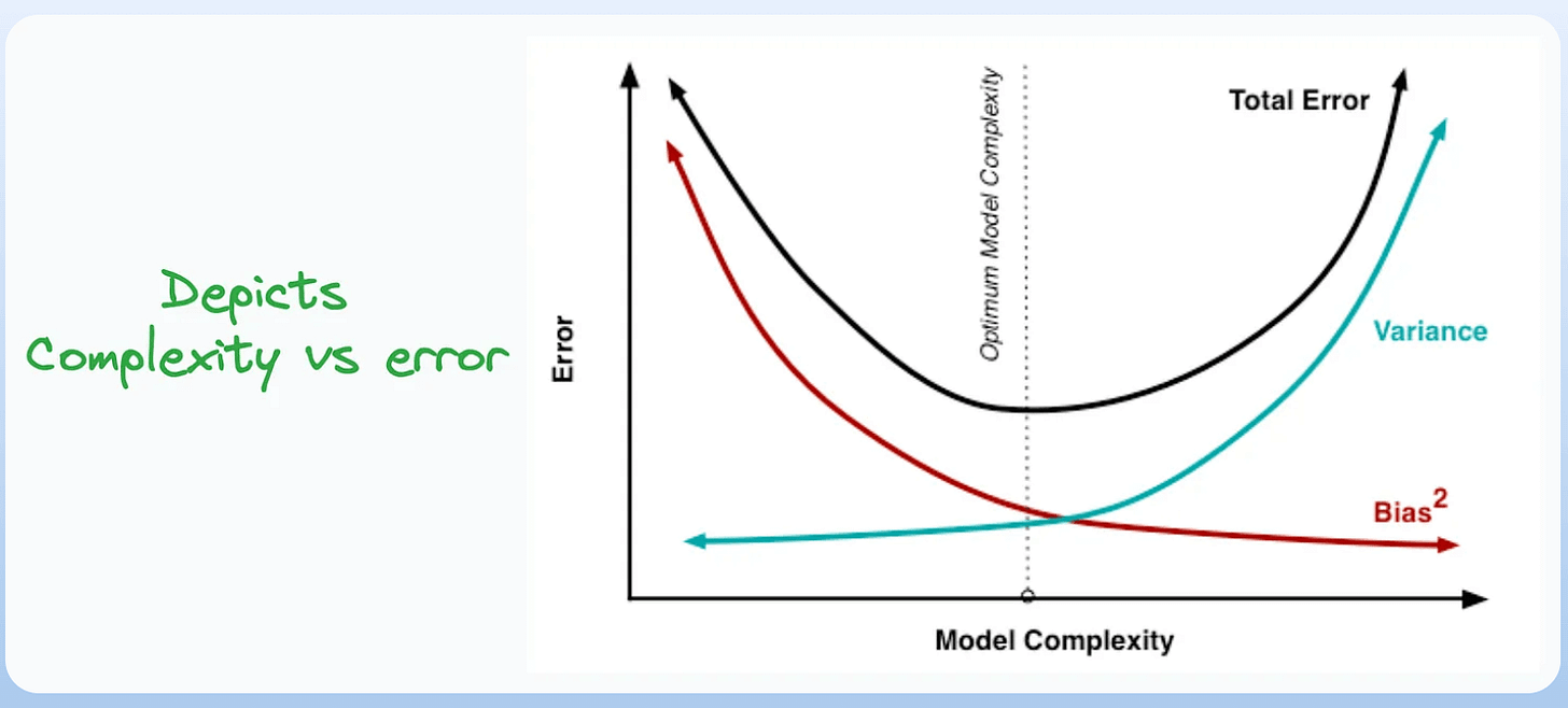
10) Bias-Variance Tradeoff:
- It’s probably the most popular plot on this list.
- It is used to find the right balance between the bias and the variance of a model against complexity.
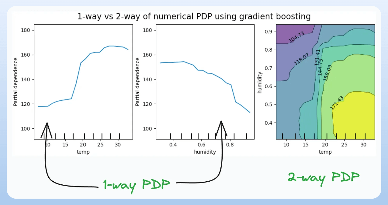
11) Partial Dependency Plots:
- Depicts the dependence between target and features.
- A plot between the target and one feature forms → 1-way PDP.
- A plot between the target and two feature forms → 2-way PDP.
- In the leftmost plot, an increase in temperature generally results in a higher target value.
- We covered model interpretability extensively in our 3-part crash course. Start here: A Crash Course on Model Interpretability →
👉 Over to you: Which important plots have I missed here?
Thanks for reading!