Dimensionality Reduction
Avoid Using PCA for Visualization Unless...
...this plot says so.

Avi Chawla
...this plot says so.

TODAY'S ISSUE
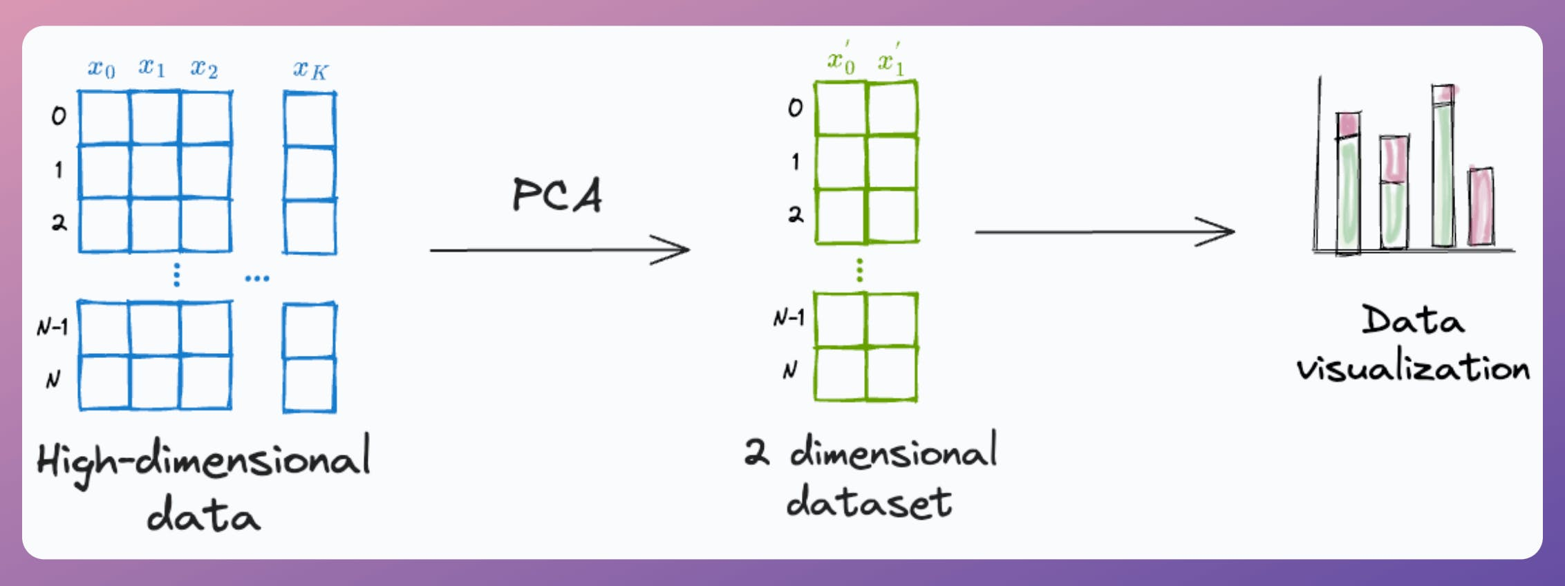
PCA, by its very nature, is a dimensionality reduction technique.
Yet, at times, it is used to visualize high-dimensional datasets by projecting the data into two dimensions.
Here's the problem with it.
After applying PCA, each new feature (PC1, PC2, ..., PC-N) captures a fraction of the original data variance:
PC1 may capture 40%.PC2 may capture 25%.And so on.
Thus, using PCA for visualization by projecting the data to 2-dimensions only makes sense if the first two principal components collectively capture most of the original data variance.
This is rarely true in practice.
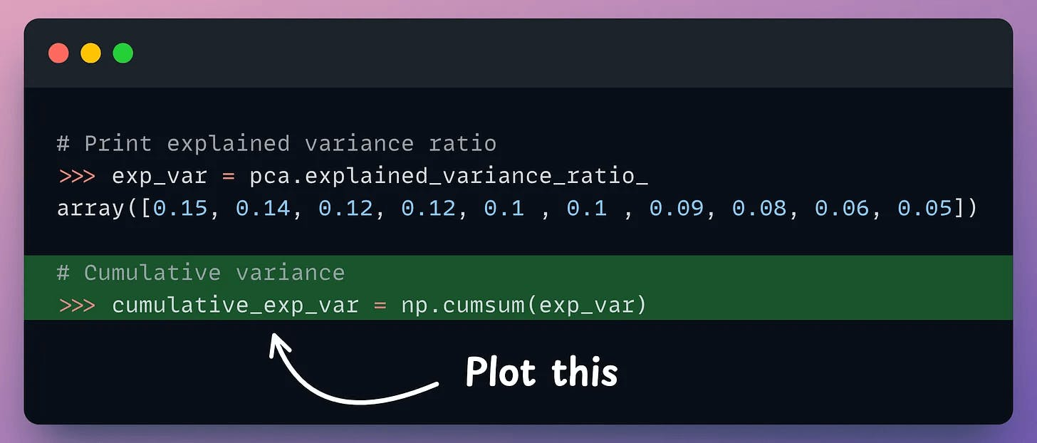
But it is possible to verify if PCA's visualization is useful by creating a cumulative explained variance (CEV) plot.
It plots the cumulative variance explained by principal components.
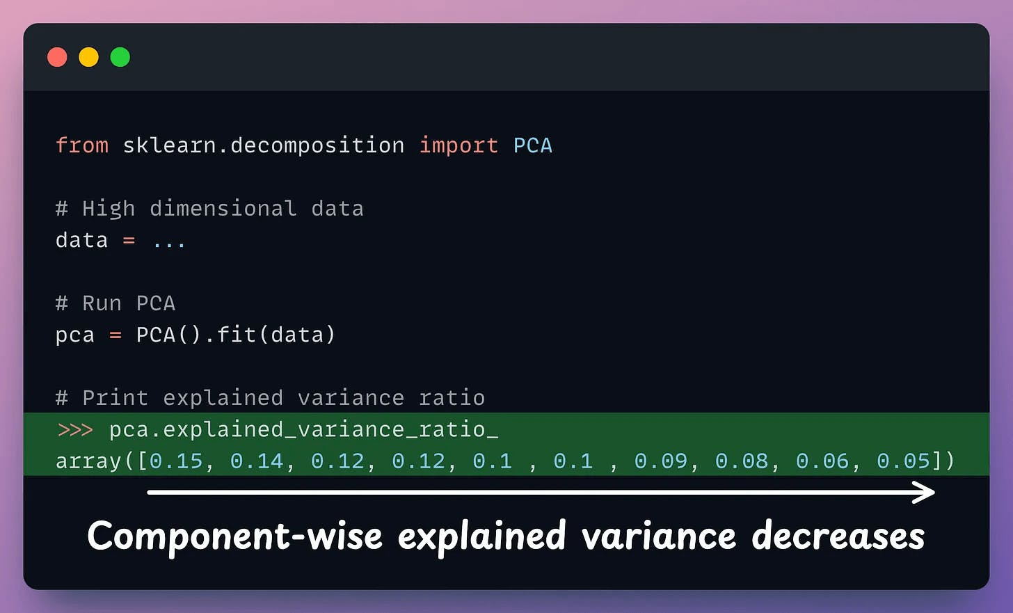
In sklearn, the explained variance fraction is available in the explained_variance_ratio_ attribute:
Create a cumulative plot of explained variance and check whether the first two components explain the majority of variance.
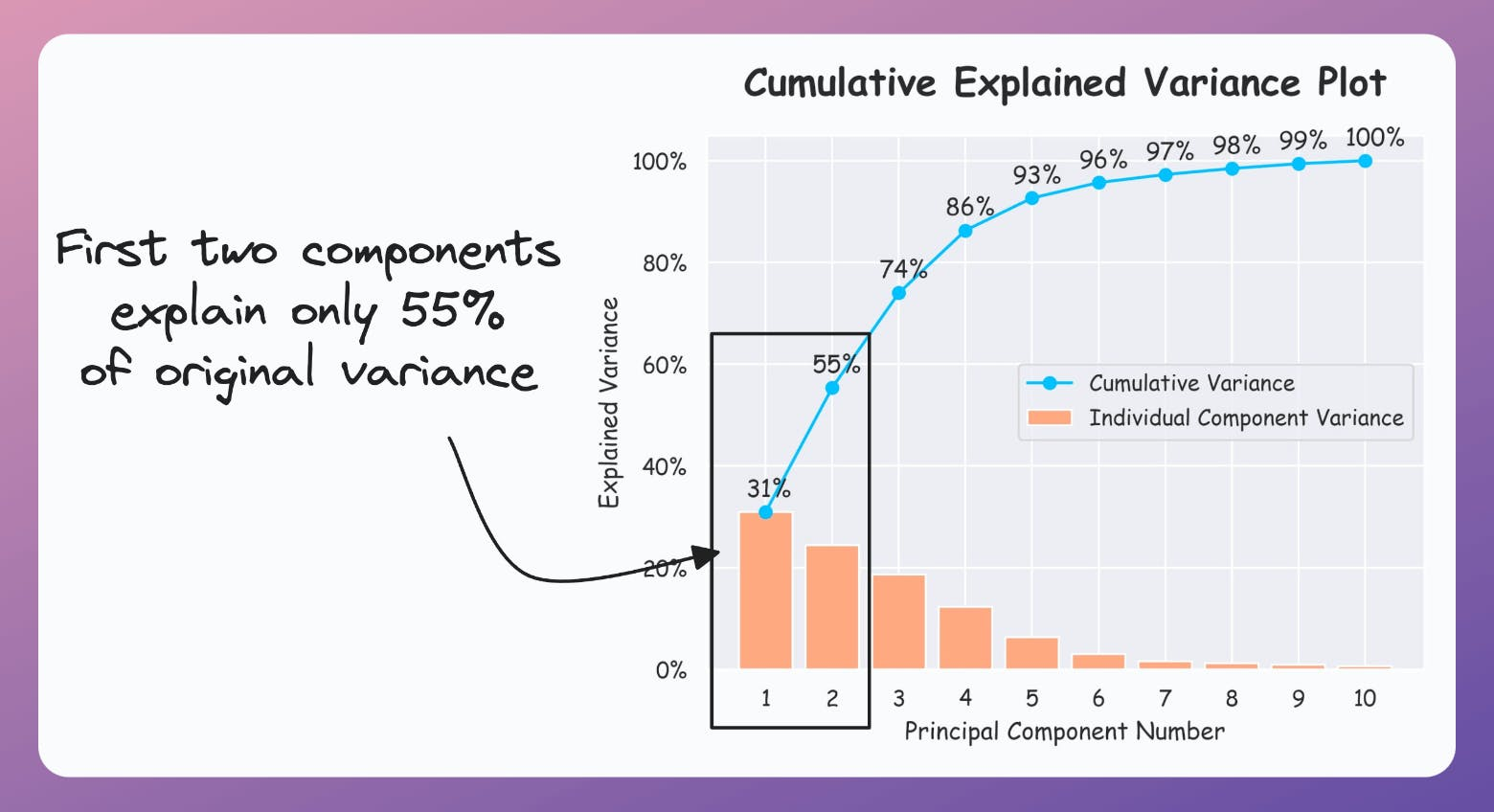
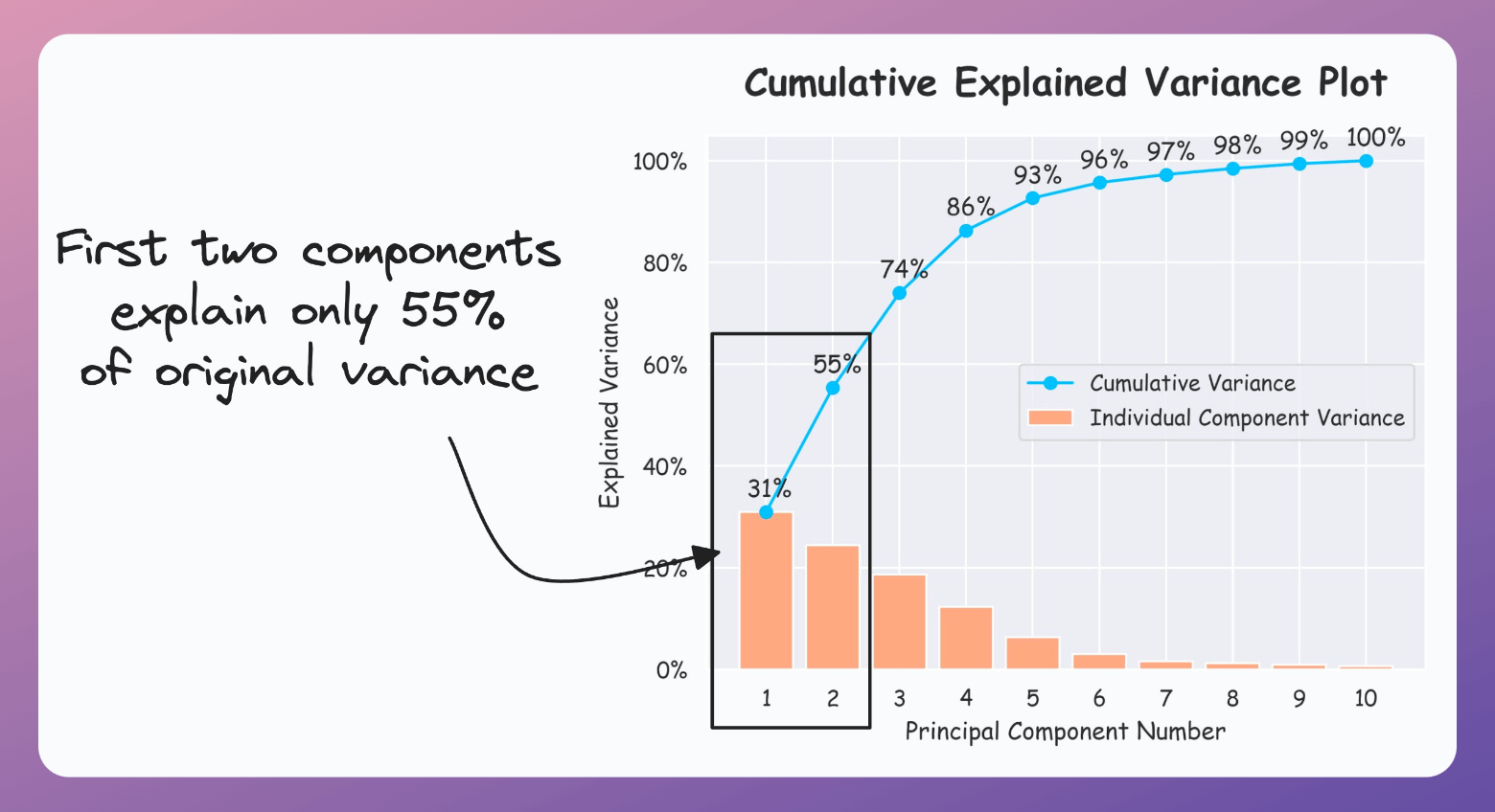
If the plot looks the following, your PCA visualizations are misleading since the first two components only explain 55% of the variance:
But if the plot looks like the following, it is safe to use PCA:
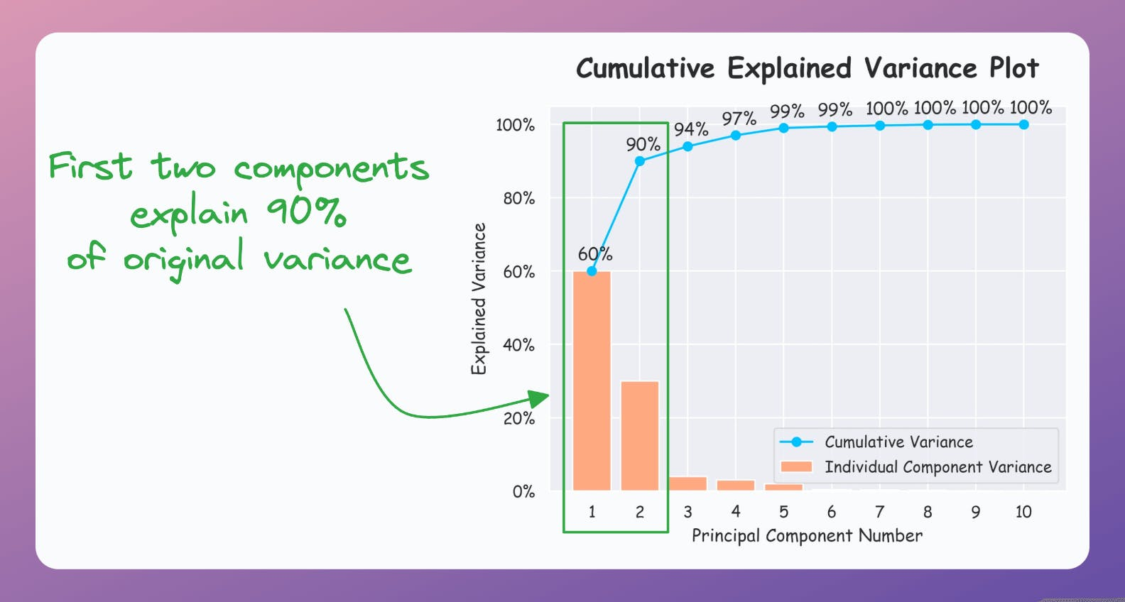
As a takeaway, use PCA for 2D visualization only when the above plot suggests so.
That said, use the CEV plot only for dimensionality reduction to determine how many dimensions to project the data to when using PCA.
For instance, in the following plot, projecting to 5 dimensions could be good (depending on how much information loss you can tolerate):

For visualization, however, use techniques specifically designed for it, like t-SNE, UMAP, etc.
We formulated and implemented (in NumPy) t-SNE from scratch here.
We discussed the mathematical details of PCA and derived it from scratch here.
👉 Over to you: What are some other problems with using PCA for visualization?
We formulated and implemented (in NumPy) t-SNE from scratch here.
We discussed the mathematical details of PCA and derived it from scratch here.
Versioning GBs of datasets is practically impossible with GitHub because it imposes an upper limit on the file size we can push to its remote repositories.
That is why Git is best suited for versioning codebase, which is primarily composed of lightweight files.
However, ML projects are not solely driven by code.
Instead, they also involve large data files, and across experiments, these datasets can vastly vary.
To ensure proper reproducibility and experiment traceability, it is also necessary to version datasets.
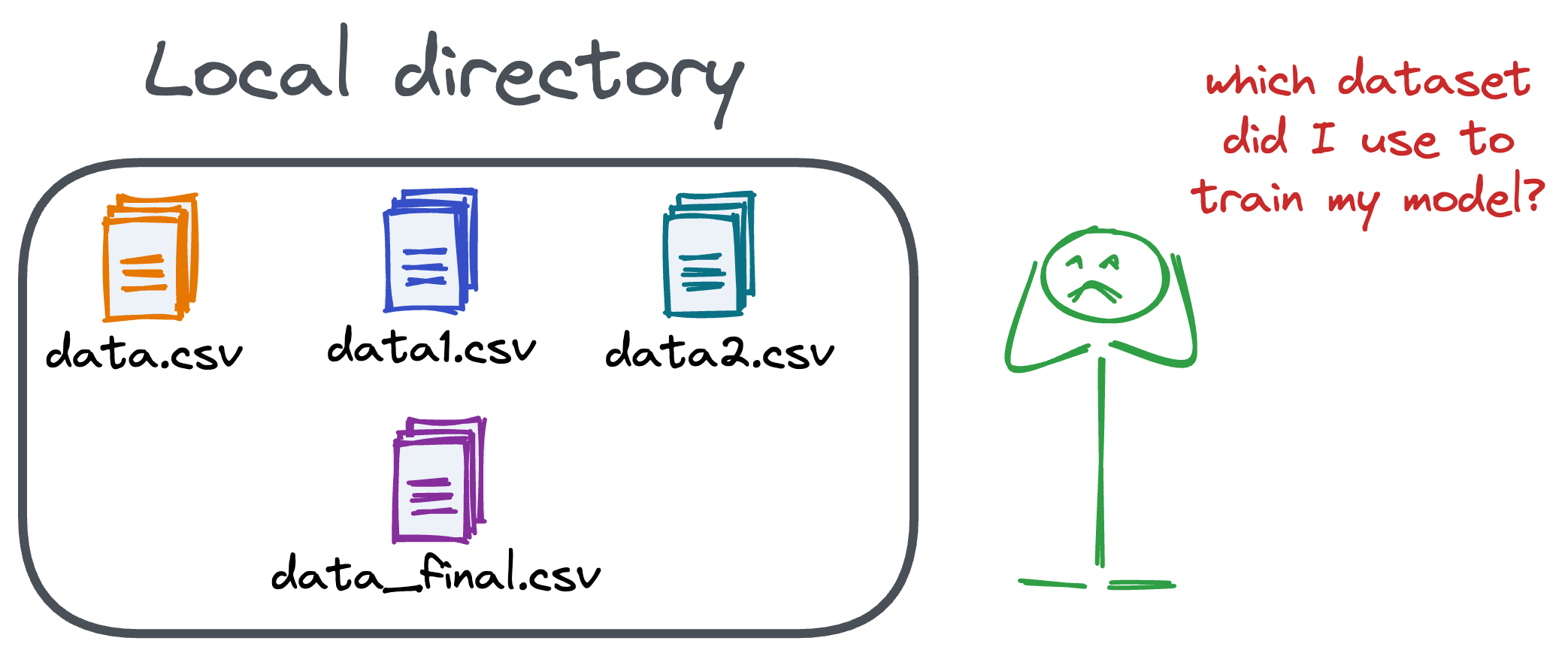
Data version control (DVC) solves this problem.
The core idea is to integrate another version controlling system with Git, specifically used for large files.
̱Here's everything you need to know (with implementation) about building 100% reproducible ML projects →
Model accuracy alone (or an equivalent performance metric) rarely determines which model will be deployed.
Much of the engineering effort goes into making the model production-friendly.
Because typically, the model that gets shipped is NEVER solely determined by performance — a misconception that many have.
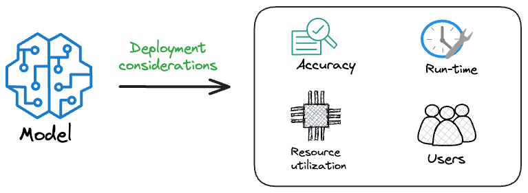
Instead, we also consider several operational and feasibility metrics, such as:
For instance, consider the image below. It compares the accuracy and size of a large neural network I developed to its pruned (or reduced/compressed) version:
Looking at these results, don’t you strongly prefer deploying the model that is 72% smaller, but is still (almost) as accurate as the large model?
Of course, this depends on the task but in most cases, it might not make any sense to deploy the large model when one of its largely pruned versions performs equally well.
We discussed and implemented 6 model compression techniques in the article here, which ML teams regularly use to save 1000s of dollars in running ML models in production.
Learn how to compress models before deployment with implementation →