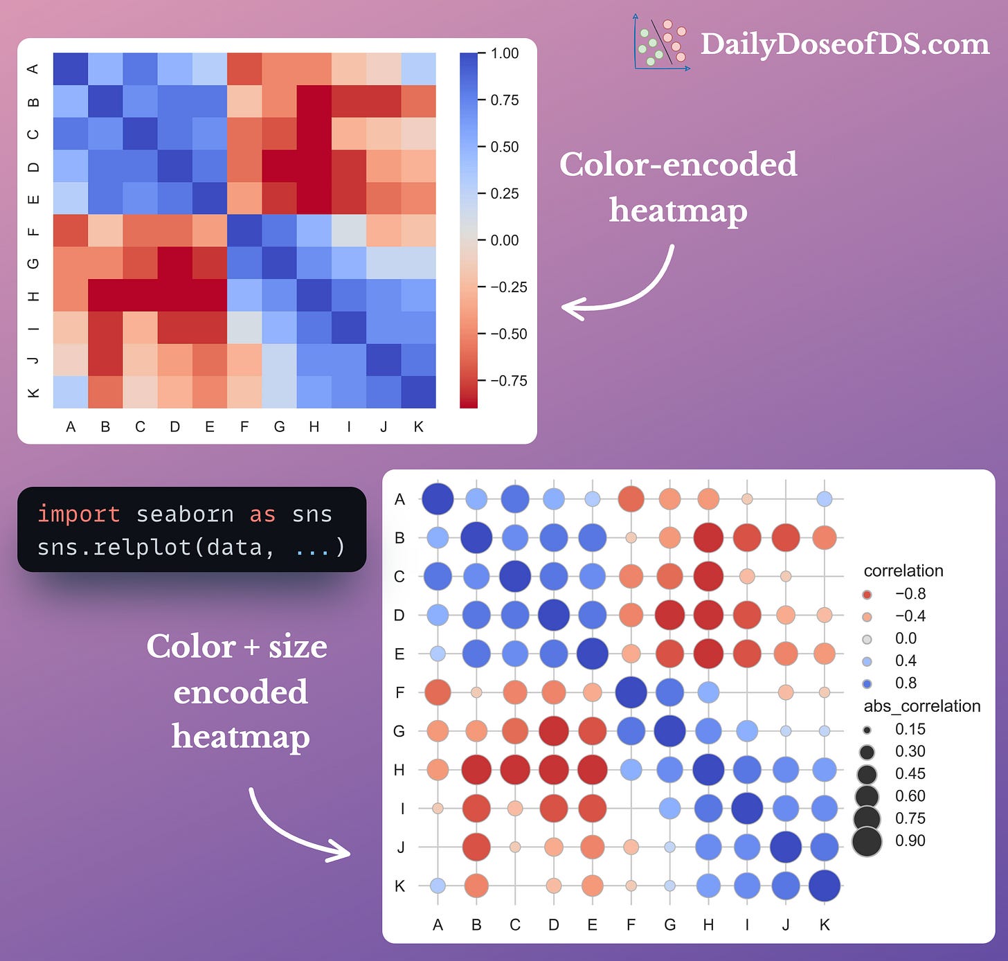
In essence, the bigger the size, the higher the absolute value:
This is especially useful to make heatmaps cleaner, as many values nearer to zero will immediately shrink.
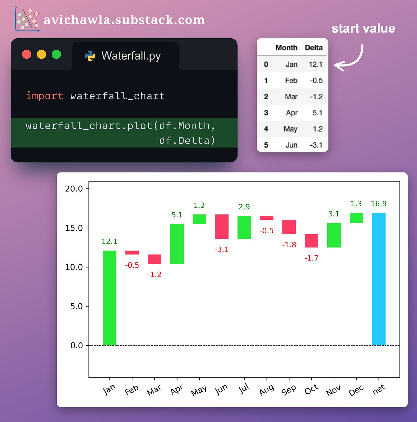
#2) Waterfall charts
To visualize the change in value over time, a line (or bar) plot may not always be an apt choice.
This is because a line plot (or bar plot) depicts the actual values in the chart. Thus, it is difficult to visually estimate the scale and direction of incremental changes.
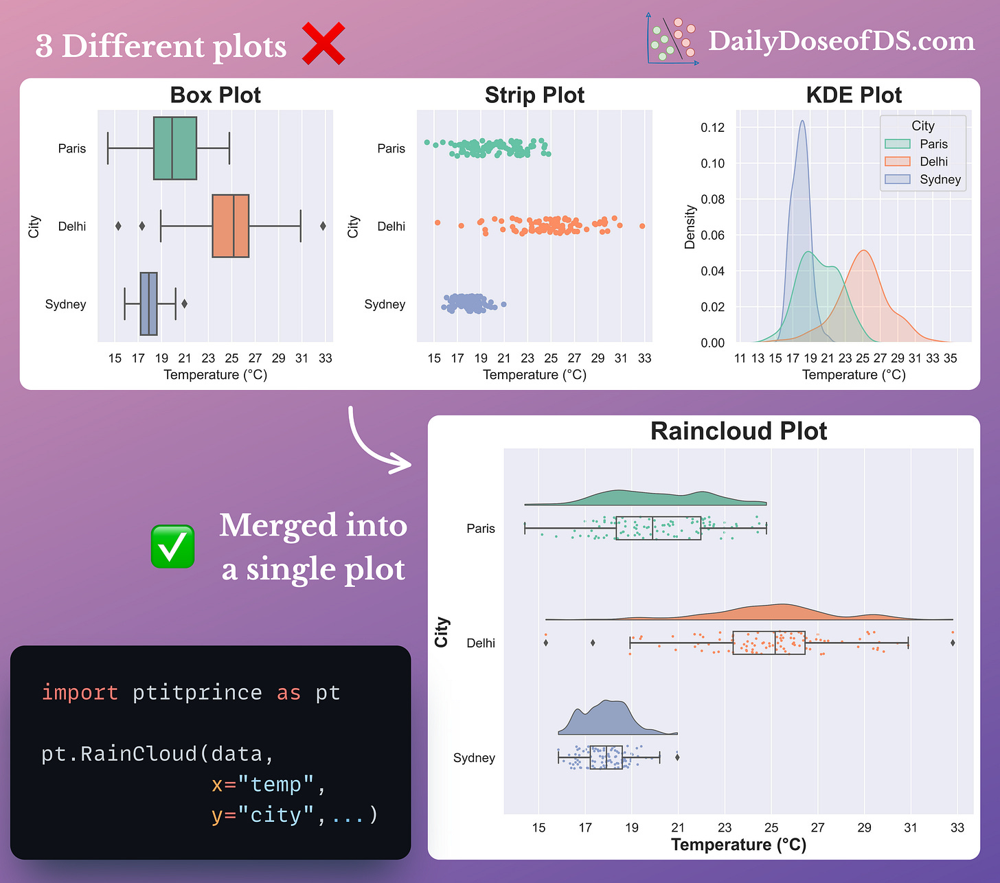
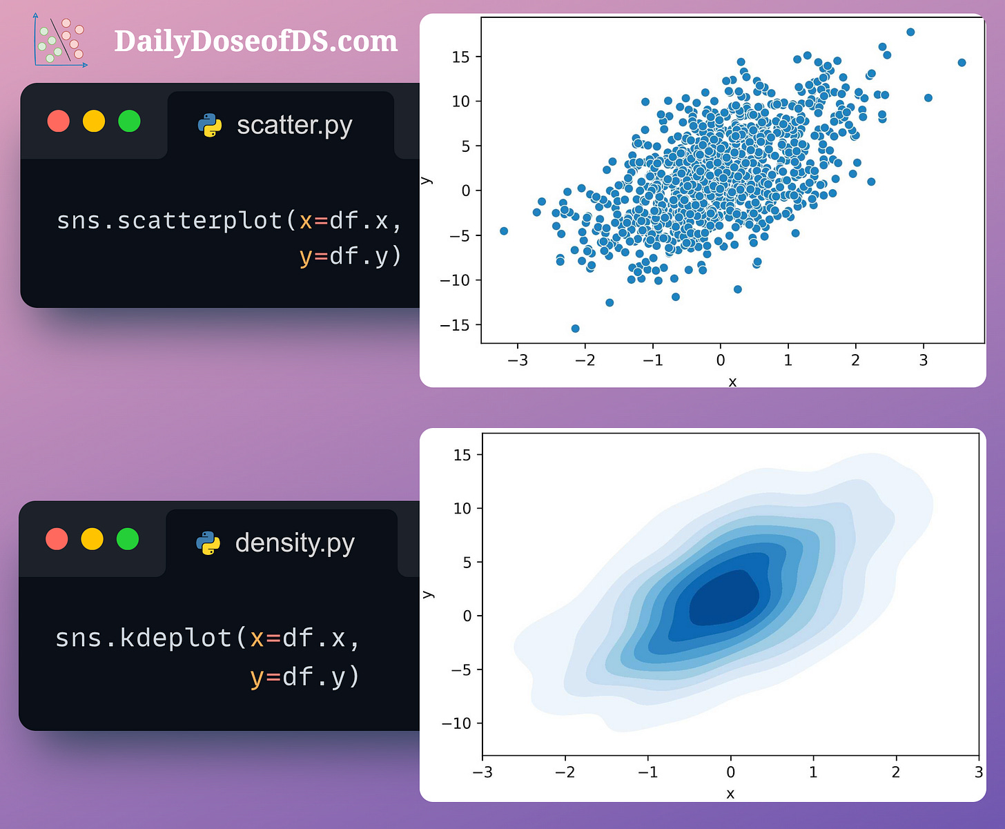
KDE plots for the probability distribution of data.
With Raincloud plots, you can:
Combine multiple plots to prevent incorrect/misleading conclusions
Reduce clutter and enhance clarity
Improve comparisons between groups
Capture different aspects of the data through a single plot
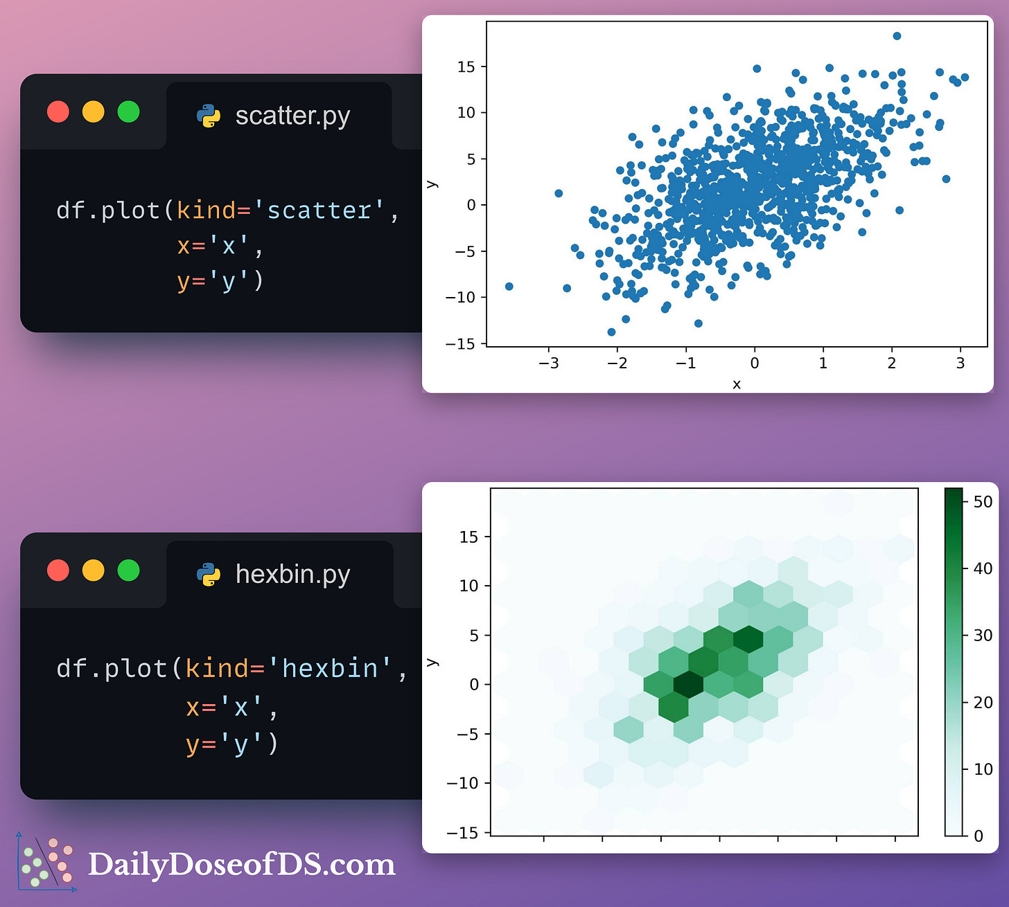
#5-6) Hexbin and Density Plots
Scatter plots can get too dense to interpret when you have thousands of data points.
Instead, you can replace them with Hexbin plots.
Hexbin plots bin the area of a chart into hexagonal regions. Each region is assigned a color intensity based on the method of aggregation used (the number of points, for instance).
Another choice is a density plot, which illustrates the distribution of points in a two-dimensional space.
A contour is created by connecting points of equal density. In other words, a single contour line depicts an equal density of data points.
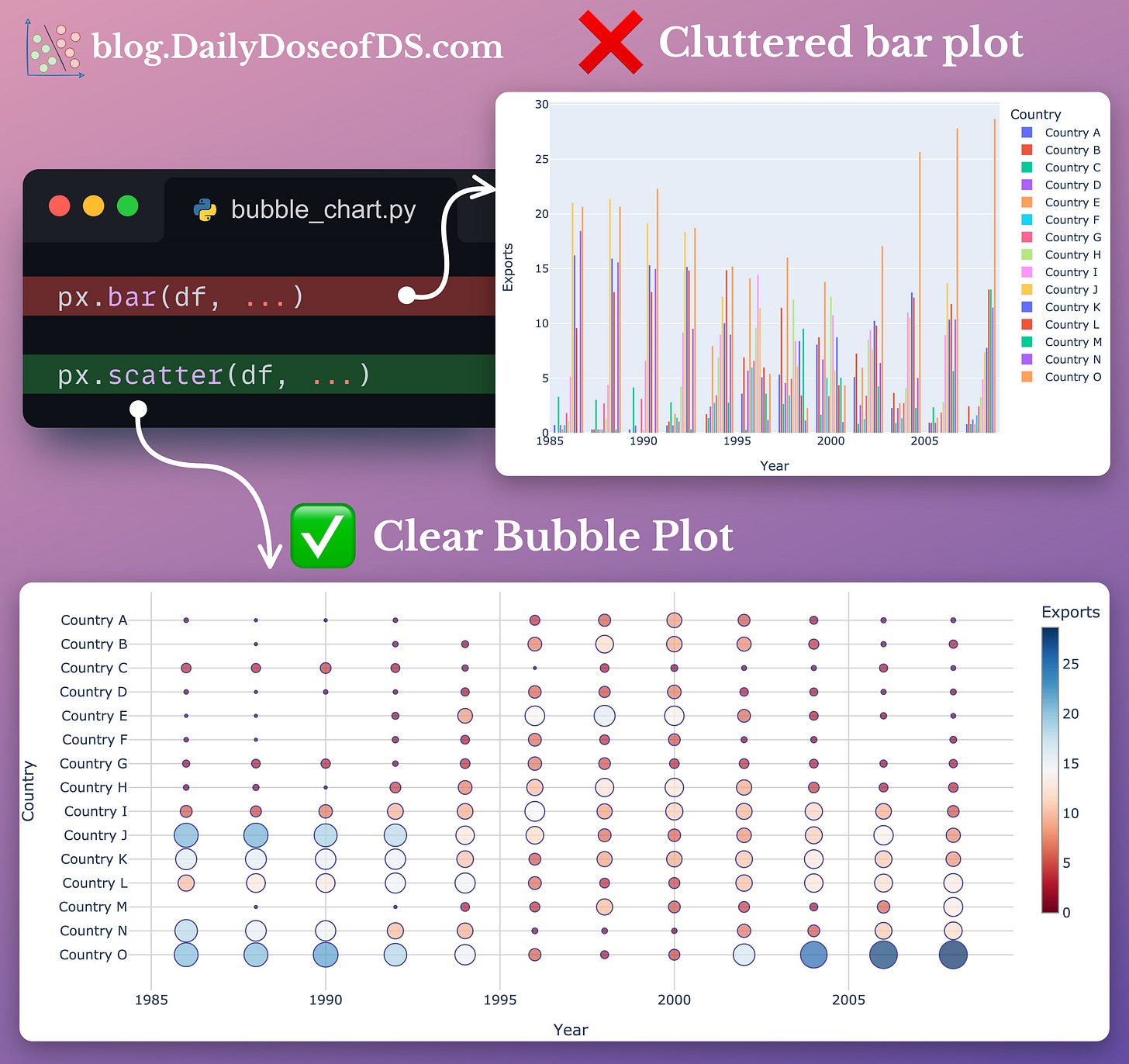
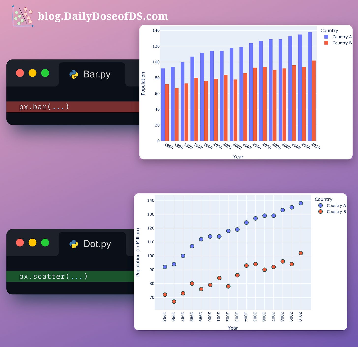
#7-8) Bubble charts and Dot plots
As discussed above, bar plots quickly get messy and cluttered as the number of categories increases.
Both dot plots and bubble charts are based on the idea that, at times, when we have a bar plot with many bars, we’re often not paying attention to the individual bar lengths.
Instead, we mostly consider the individual endpoints that denote the total value.
These plots precisely help us depict that while also eliminating the long bars of little to no use.
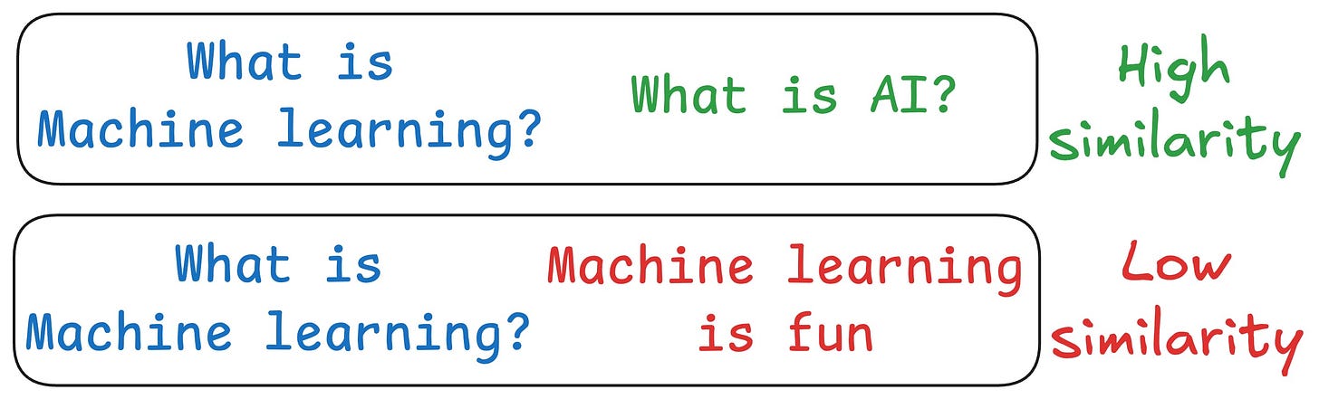
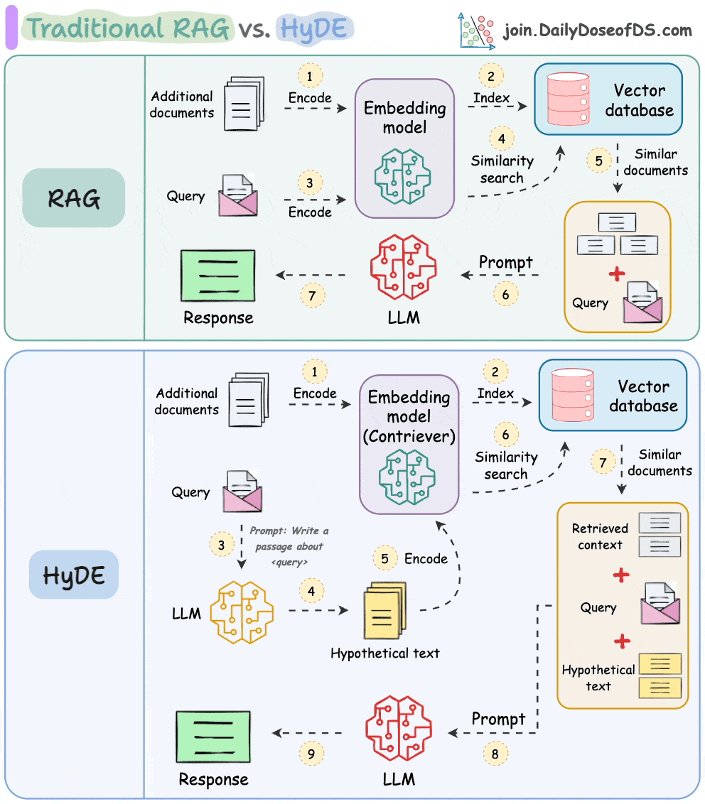
One critical problem with the traditional RAG system is that questions are not semantically similar to their answers.
As a result, several irrelevant contexts get retrieved during the retrieval step due to a higher cosine similarity than the documents actually containing the answer.
HyDE solves this.
The following visual depicts how it differs from traditional RAG and HyDE.
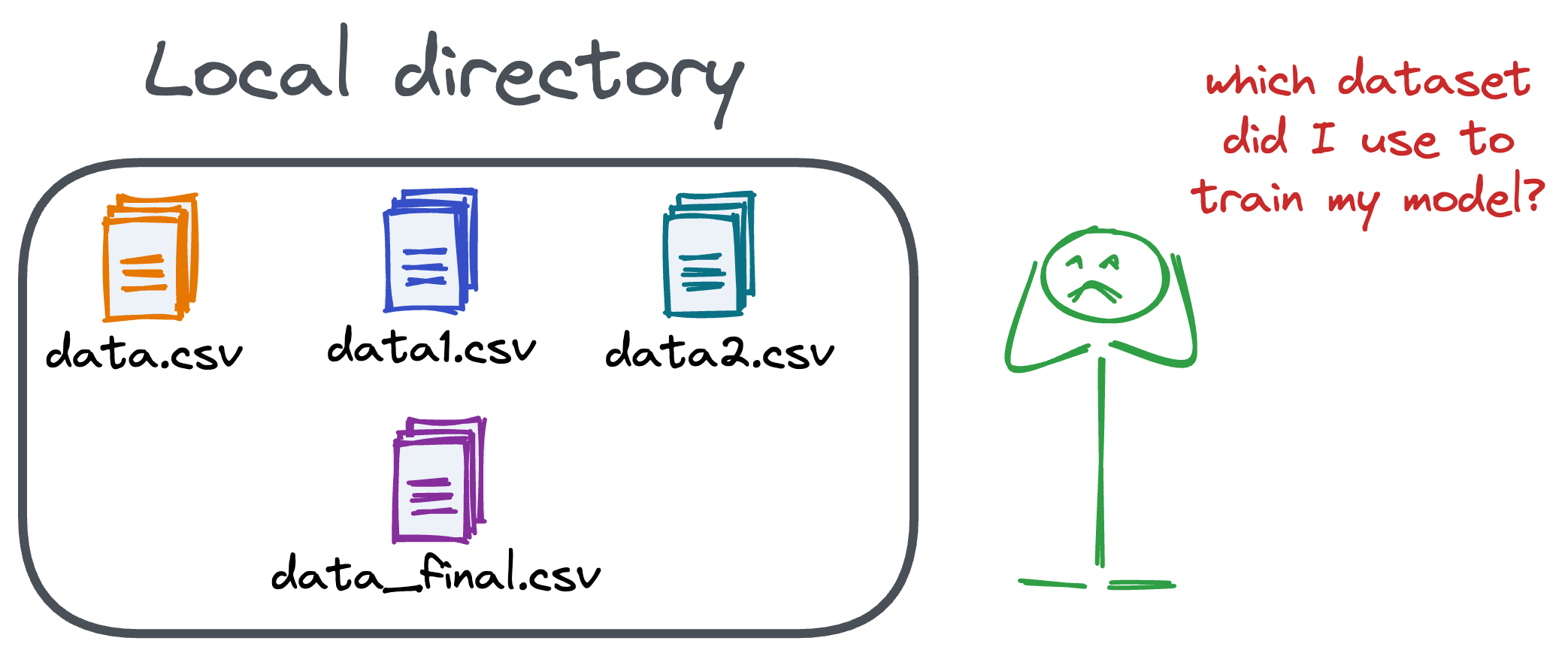
Versioning GBs of datasets is practically impossible with GitHub because it imposes an upper limit on the file size we can push to its remote repositories.
That is why Git is best suited for versioning codebase, which is primarily composed of lightweight files.
However, ML projects are not solely driven by code.
Instead, they also involve large data files, and across experiments, these datasets can vastly vary.
To ensure proper reproducibility and experiment traceability, it is also necessary to version datasets.
Data version control (DVC) solves this problem.
The core idea is to integrate another version controlling system with Git, specifically used for large files.